Website Checklist: How to Build a Landing Page That Converts
TL;DR - Key Takeaways
- Landing pages with complete checklists convert 40-60% better than pages missing critical elements
- Must-have elements (value proposition, CTA, mobile optimization) are non-negotiable - without them, expect 50%+ visitor loss
- Business stage matters: idea-stage startups need different elements than scaling companies
- Remove navigation from landing pages - every link is an exit opportunity (25-40% conversion improvement)
- Page speed under 3 seconds is critical - each additional second costs 7% in conversions
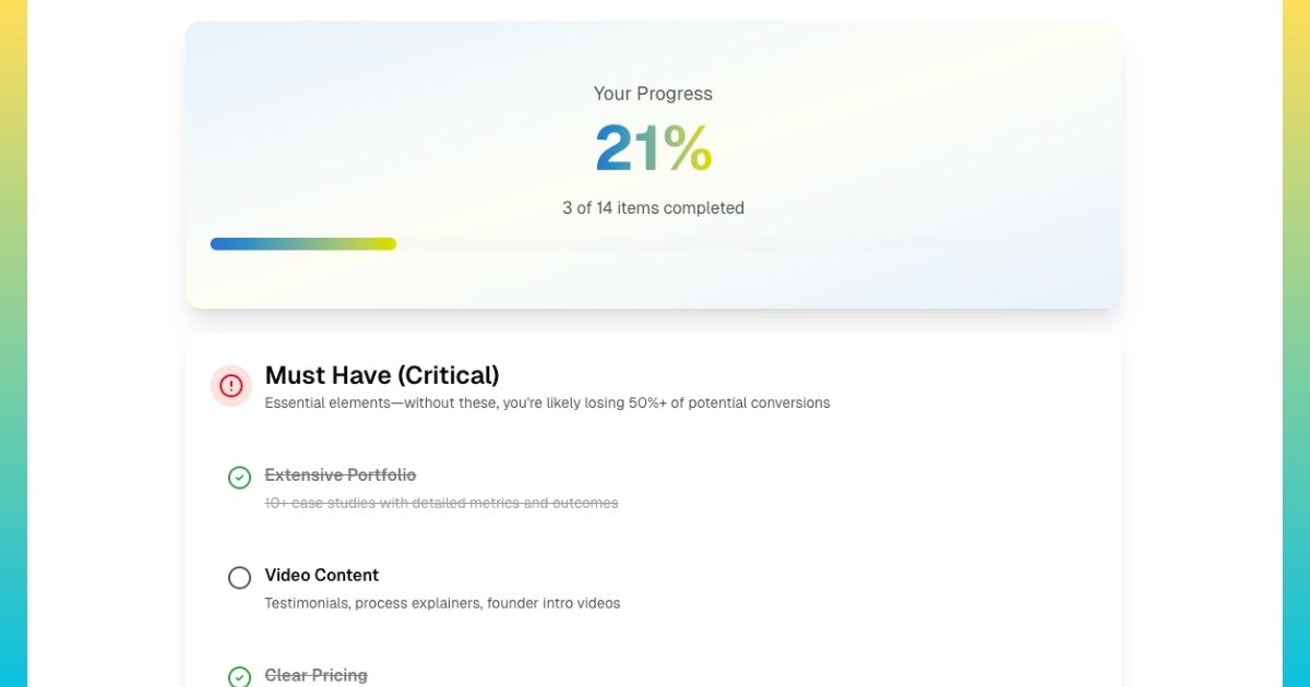
- Use our interactive checklist tool to get personalized must-have, nice-to-have, and do-later recommendations
What is a Website Checklist and Why Does It Matter?
A website checklist (or landing page checklist) is a systematic list of essential elements, features, and optimizations that high-converting pages include. Rather than building pages based on intuition or copying competitors blindly, checklists provide proven frameworks based on thousands of A/B tests and conversion rate optimization studies. Think of it as a quality assurance process - ensuring nothing critical is overlooked before launching campaigns or spending ad budget driving traffic to underperforming pages.
The distinction matters: a website serves multiple purposes with interconnected pages (homepage, about us, product pages, blog, contact), while a landing page is a single-purpose page focused exclusively on one conversion goal, capturing leads, driving sales, registering attendees, or generating signups. Landing pages remove all navigation and distractions to maintain singular focus. The checklist for each differs significantly because the goals and user contexts diverge.
Why Most Landing Pages Fail (And How Checklists Prevent It)
The average landing page conversion rate is just 2.35%. This means 97.65% of visitors leave without converting - a staggering waste of traffic, ad spend, and opportunity. Why? Most pages fail due to systematic, preventable mistakes: unclear value propositions, slow load times, poor mobile experience, missing trust signals, or confusing conversion paths.
Here's the data: According to Unbounce's conversion benchmark report, the top 25% of landing pages convert at 5.31% or higher - more than 2x the average. The top 10% convert at 11.45%+. What separates high performers from failures? Systematic implementation of conversion best practices—exactly what checklists ensure.
| Landing Page Type | Average Conversion Rate | Top 25% Conversion Rate |
|---|---|---|
| Lead Generation (B2B) | 2.3% | 5.2% |
| E-commerce Product | 1.8% | 4.1% |
| SaaS Signup | 3.1% | 7.3% |
| Webinar Registration | 8.6% | 18.2% |
| Content Download | 12.3% | 25.7% |
Notice the pattern: top performers convert at 2-3x higher rates. The difference isn't magic - it's systematic execution of fundamentals. For more on identifying and fixing specific conversion issues, see our comprehensive website conversion analysis guide.
Not sure where to start?
We'll walk through your landing page with you — for free.
Book a free 20-minute call and we'll tell you exactly what's missing, what to prioritize, and what an AI agent could do to turn your page into a 24/7 conversion machine.
What Are the Must-Have Elements Every Landing Page Needs?
Regardless of business type or stage, certain elements are non-negotiable. These are the conversion fundamentals—without them, you're likely losing 50-80% of potential conversions before visitors even consider your offer.
The 7 Non-Negotiable Landing Page Elements
1. Clear Value Proposition (Above the Fold)
Your headline and subheadline must communicate what you offer, who it's for, and why it matters, in 5 seconds or less. This isn't about clever wordplay; it's about clarity and specificity.
❌ Weak Value Proposition:
"The Best CRM Solution for Modern Businesses"
✅ Strong Value Proposition:
"Close 40% More Deals with AI-Powered Sales Automation Built for B2B Teams Under 50"
Notice the difference: the strong version specifies the outcome (40% more deals), the method (AI automation), and the target audience (B2B teams under 50). No ambiguity about what's being offered or who it's for.
2. Single, Prominent Call-to-Action
Your primary CTA button must be visible above the fold (without scrolling) and repeated 2-3 times down the page. Use action-oriented, first-person copy that tells users exactly what happens next.
- Generic (weak): "Submit," "Download," "Get Started"
- Specific (strong): "Get My Free Analysis," "Start My 14-Day Trial," "Schedule My Demo"
CTAs using first-person language ("My," "I") convert 90% better than generic third-person buttons according to Unbounce research. The specificity reduces uncertainty about what happens after clicking.
3. Mobile-Optimized Experience
60-70% of traffic comes from mobile devices. If your landing page doesn't work perfectly on mobile, you're losing the majority of potential customers immediately.
Mobile optimization checklist:
- Text readable without zooming (16px minimum font size)
- Buttons meet 44x44 pixel touch target minimum
- Forms stack vertically (single column)
- No horizontal scrolling required
- Page loads in under 3 seconds on 4G
4. Fast Page Speed (Under 3 Seconds)
Every additional second of load time reduces conversions by 7%. Pages taking 5+ seconds to load lose 50%+ of visitors before content even displays. Speed is a conversion fundamental, not a nice-to-have.
Quick wins: Compress images (use WebP format), enable browser caching, minify CSS/JavaScript, use a CDN. Our complete speed optimization guide covers implementation details.
5. Social Proof
B2B buyers are risk-averse. Social proof reduces perceived risk by demonstrating others' success. Even early-stage companies can include social proof.
Social proof hierarchy (strongest to weakest):
- Video testimonials with results: "Increased revenue 40% in 6 months" - Name, Title, Company
- Written testimonials with specifics: Real names, photos, companies, outcomes
- Customer logos: Recognizable brands using your product/service
- Usage metrics: "10,000+ companies," "500,000+ users," "$50M+ revenue generated"
- Media mentions: "As featured in [Publication]"
6. Benefit-Focused Copy (Not Features)
Visitors care about outcomes, not technical specifications. Translate every feature into a concrete business benefit or result.
❌ Feature-focused:
"Advanced workflow automation with 50+ integrations"
✅ Benefit-focused:
"Reduce manual data entry by 15 hours per week and automate repetitive tasks so your team focuses on closing deals"
7. Simplified Forms (3-5 Fields Maximum)
Every form field reduces conversion rate by 5-10%. Ask only for information you'll actually use immediately.
Form field guidelines by offer type:
- Newsletter/content: Email only (1 field)
- Ebook/guide download: Name, email, company (3 fields)
- Demo request: Name, email, company, phone (4 fields)
- Consultation: Name, email, company, phone, role (5 fields max)
For more on form optimization strategies, see our complete B2B lead generation guide.
How Does Business Stage Affect Your Landing Page Checklist?
Not all landing pages should look the same. An idea-stage startup has different resources, constraints, and credibility levels than a scaling company. Attempting to implement every possible optimization wastes time and resources—focus on stage-appropriate priorities.
| Stage | Must-Have Elements | Skip Until Later |
|---|---|---|
| Idea / Pre-Launch (0 customers) | • Clear value proposition • Simple email capture form • Founder story/vision • Mobile responsive • Fast page speed | • Customer testimonials (don't have yet) • Advanced analytics (not enough traffic) • A/B testing (insufficient volume) • Live chat (focus on building product) |
| Early Traction (1-50 customers) | • All idea-stage elements, plus: • 3-5 customer testimonials • Customer logos • Product screenshots/demo • Clear pricing (or starting prices) • Trust badges | • Video testimonials (text works fine) • Interactive demos (screenshots sufficient) • Chatbot automation (humans better now) • Localization (focus on primary market) |
| Scaling (50+ customers) | • All early traction elements, plus: • 10+ testimonials throughout page • 3-5 video testimonials • Detailed case studies • Advanced analytics & heatmaps • Security certifications • Live chat support | • AI chatbots (human support better) • Multi-language (unless data shows need) • Complex personalization (focus on fundamentals) |
Notice the progression: idea stage focuses on clarity and vision, early traction adds social proof and product demonstration, scaling stage implements advanced optimization and comprehensive trust building. Skipping stages or implementing out of order wastes resources on features that don't yet move the conversion needle.
The shortcut
You can check every box on the checklist — and still lose visitors who just had one unanswered question.
Even a well-built landing page is passive. Visitors with questions bounce. Visitors unsure about pricing leave. Visitors who almost converted but wanted reassurance — gone. An AI conversion agent solves this by staying live on your page and handling those moments in real time.
- ✓Answers the questions your copy doesn't cover — pricing edge cases, integration questions, "is this right for me?" — handled instantly, without losing the visitor
- ✓Handles objections in real time — the same objections you'd address in a sales call, surfaced and resolved before the visitor decides to leave
- ✓Replaces your "Book a Demo" form with a real conversation — qualifies the visitor, then books the call automatically, cutting time-to-meeting from days to minutes
- ✓Captures leads from visitors who weren't ready to fill out the form — exit-intent engagement that recovers prospects before they bounce for good
We build, deploy, and host the agent for you. You keep the checklist and gain a 24/7 closer.
What Elements Boost Conversions But Aren't Essential?
After implementing must-haves, these "nice-to-have" elements can improve conversions by 10-30% when executed well. Prioritize based on resources and expected impact.
High-Impact Optional Elements
- Exit Intent Popups: Capture visitors trying to leave with last-chance offer or value proposition. Can recover 10-15% of abandoning visitors. Keep offer simple and compelling - avoid overwhelming with multiple choices.
- Video Content: Product demo videos (30-90 seconds) showing actual interface and usage. Video testimonials with real customers discussing specific results. Video increases engagement time 88% and can improve conversions 20-30% for complex products.
- Social Proof Notifications: Real-time popups showing recent conversions: "Sarah from Acme Corp just signed up" or "127 people viewed this page in the last hour." Creates urgency and reduces hesitation. Use authentic data only - fake notifications destroy trust.
- FAQ Section: Address 5-8 most common objections visitors have. Place near bottom of page after main content. Reduces support inquiries and removes conversion barriers. Questions should reflect actual customer concerns, not invented scenarios.
- Comparison Tables: "Us vs Competitor" pages showing feature advantages. Particularly effective for B2B SaaS where prospects actively evaluate alternatives. Be honest - highlighting real differences builds more credibility than claiming superiority in everything.
What Common Landing Page Mistakes Should You Avoid?
Even pages with must-have elements can fail due to these systematic mistakes. Avoid them to maximize conversion potential.
❌ Mistake #1: Multiple Conversion Goals
Offering "Request Demo" and "Download Whitepaper" and "Start Free Trial" on the same page creates decision paralysis. Visitors don't know which action to take, so they take none. Solution: One landing page, one conversion goal, one CTA.
❌ Mistake #2: Keeping Navigation Links
Every navigation link is an exit opportunity. Visitors who click away rarely return. Remove header navigation, sidebar links, and excessive footer links. Keep only legally required links (privacy policy, terms). Landing pages without navigation convert 25-40% better.
❌ Mistake #3: Generic Stock Photography
Obvious stock photos (corporate handshakes, diverse team high-fiving, person pointing at whiteboard) reduce credibility. Visitors recognize fake imagery instantly. Use real product screenshots, actual customer photos, or authentic team pictures. If you must use stock photos, choose natural lifestyle imagery over posed corporate shots.
❌ Mistake #4: Asking for Too Much Information
Forms with 10+ fields reduce conversion by 50%+ compared to 3-5 field forms. Every field creates friction. Ask: "Do we need this information before first contact, or can we collect it during follow-up?" For early-stage leads, less information (with higher volume) beats more information (with lower volume).
❌ Mistake #5: Ignoring Load Speed
Beautiful landing page taking 6 seconds to load will convert worse than ugly, fast page. Compress images aggressively (use WebP format, reduce dimensions), minimize JavaScript, enable caching. Every second counts - literally 7% per second in conversion rate. Learn more about how to make your website faster in this article.
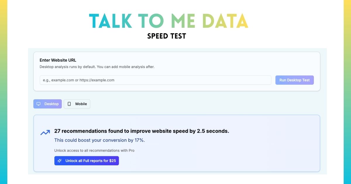
How Can You Use AI to Optimize Your Landing Page?
Manual landing page optimization requires expertise in copywriting, design, conversion psychology, and technical implementation. Even with expertise, analyzing all elements takes hours. AI accelerates this dramatically while reducing subjective bias.
Talk to me Data analyzes landing pages across all checklist categories instantly: value proposition clarity, CTA effectiveness, mobile experience, page speed, trust signals, form optimization, and more. Rather than guessing what to fix, get a prioritized list ranked by expected conversion impact. Each recommendation includes specific implementation guidance and estimated improvement percentage.
For example: instead of "improve your headline," AI provides "Current headline focuses on features not benefits. Recommend: '[Specific Outcome] for [Target Audience] in [Timeframe]' structure. Expected impact: 15-25% conversion increase based on similar pages." For more on AI-powered optimization, see our complete guide to using AI for conversion optimization.
How Do You Implement Your Landing Page Checklist?
Having a checklist is step one. Systematic implementation is step two. Use this framework to go from checklist to live, converting page.
The 4-Phase Implementation Framework
Phase 1: Audit Current State (Week 1)
Before building or optimizing, understand where you stand. Generate your personalized checklist using our tool, then audit your current page against every must-have element.
Audit questions:
- Can someone understand your offer in 5 seconds? (Ask 3 people unfamiliar with your product)
- Is your primary CTA visible without scrolling on mobile and desktop?
- Does your page load in under 3 seconds on mobile? (Test with Google PageSpeed Insights)
- Do you have 3+ pieces of social proof (testimonials, logos, metrics)?
- Does your form have 5 or fewer fields?
Document gaps systematically. This baseline is critical for measuring improvement.
Phase 2: Fix Critical Issues (Week 2-3)
Prioritize must-have elements only. Don't get distracted by nice-to-haves yet—focus exclusively on conversion fundamentals.
Implementation priority order:
- Value proposition: Rewrite headline using [Outcome] + [Audience] + [Timeframe] formula
- CTA optimization: Add above-fold CTA with first-person, action-oriented copy
- Mobile experience: Test on actual devices, fix any usability issues
- Page speed: Compress images, enable caching (quick wins first)
- Social proof: Add minimum 3 testimonials or customer logos
- Form simplification: Remove all non-essential fields
Phase 3: Measure Baseline (Week 4-6)
After implementing must-haves, let the page run for 2-4 weeks (depending on traffic volume) to establish baseline conversion rate. Avoid making changes during this period—you need clean data.
Track these metrics:
- Conversion rate (overall and by traffic source)
- Bounce rate and average time on page
- Form abandonment rate (started but didn't complete)
- CTA click rate (visitors who clicked vs total visitors)
- Mobile vs desktop conversion rate
Need help tracking conversions? Our 30-day sprint guide covers measurement setup in detail.
Phase 4: Implement Nice-to-Haves (Week 7+)
Once fundamentals are solid and baseline is established, add nice-to-have elements one at a time. Implement, measure impact for 1-2 weeks, then add next element. This isolates the effect of each change.
Implementation order (highest impact first):
- Exit intent popup (10-15% abandonment recovery)
- Product demo video if complex offering (20-30% engagement boost)
- FAQ section (reduces objections)
- Social proof notifications if sufficient volume
- Comparison content if competitive market
Frequently Asked Questions About Landing Page Checklists
Summary: Building Landing Pages That Convert
High-converting landing pages aren't accidents - they're systematic implementations of proven principles. The difference between average (2-3% conversion) and top-performing (8-15% conversion) isn't magic or massive budgets; it's executing fundamentals consistently.
Start with must-have elements: clear value proposition, prominent CTA, mobile optimization, fast load speed, social proof, benefit-focused copy, and simplified forms. These are non-negotiable regardless of business type or stage. Once fundamentals are solid, layer in nice-to-haves based on resources and expected impact: exit intent popups, video content, FAQ sections, comparison tables.
Avoid common mistakes that sabotage conversions: multiple conversion goals, keeping navigation links, generic stock photos, asking for too much information, and ignoring page speed. Each mistake can reduce conversions by 20-50%, they compound quickly.
Use our interactive checklist tool to generate personalized recommendations based on your specific business type and stage. Get must-have, nice-to-have, and do-later priorities tailored to where you are in your journey. Don't guess what matters - let data and proven frameworks guide implementation.
Ready to build a landing page that actually converts?
Book a free call. We'll review your page against the checklist, spot the highest-impact gaps, and show you how an AI agent can handle the conversion work your page can't do on its own.