How to Build a Website to Collect Leads: The Complete B2B Landing Page Guide
TL;DR - Key Takeaways
- B2B lead generation landing pages convert 5-15% on average vs 2-3% for general websites
- Single-purpose pages with no navigation outperform multi-page funnels by 25-40%
- Forms with 3-5 fields balance conversion rate (higher with fewer) and lead quality (higher with more)
- Above-the-fold CTAs are critical - 66% of clicks happen without scrolling
- Following up within 5 minutes increases conversion probability by 21x vs 30-minute delays
- Social proof (customer logos, testimonials) increases conversions by 34% for B2B landing pages
What is a Lead Generation Landing Page?
A lead generation landing page is a standalone web page specifically designed to capture visitor information (typically name, email, company) in exchange for something of value, such as content, demos, consultations, or free trials. Unlike general website pages with multiple navigation options and purposes, lead generation pages have a single conversion goal: getting visitors to complete a form and become leads in your sales pipeline.
In B2B contexts, leads are potential customers who have expressed interest in your product or service by providing contact information and permission to be contacted. A qualified lead meets specific criteria indicating genuine purchase potential: right company size, relevant industry, decision-making authority, and active interest timing. The quality of leads generated depends directly on landing page design, form questions, and offer relevance.
Why Do B2B Companies Need Dedicated Lead Generation Pages?
Your homepage serves multiple audiences: customers, partners, investors, job seekers, media. This dilutes focus and reduces conversion rates. Dedicated landing pages solve this by creating singular, focused experiences optimized for one audience with one goal.
Consider the data: According to HubSpot, companies with 10-15 landing pages see 55% more leads than those with fewer than 10. Companies with 40+ landing pages generate 12x more leads than those with 1-5 pages. Why? Because each landing page targets a specific audience segment, campaign, or offer - matching message to visitor intent precisely.
| Page Type | Average Conversion Rate | Primary Purpose |
|---|---|---|
| Homepage | 1-2% | Multiple (awareness, navigation, education) |
| General Service Page | 2-4% | Education and soft lead capture |
| Dedicated Landing Page | 5-15% | Single conversion goal (lead capture) |
| Optimized Landing Page | 15-25% | Highly targeted, tested, optimized |
Quick start
Don't have a domain yet? Skip it entirely.
If you just need a page that captures leads — without buying a domain, setting up hosting, or touching code — LeadLanding.dev lets you launch a lead-collecting landing page in minutes. You get a built-in form, a shareable link, and leads delivered straight to your inbox.
- ✓ No domain purchase required
- ✓ Built-in lead capture form — live immediately
- ✓ Ideal for validating an idea before committing to a full website
How to Structure a High-Converting B2B Landing Page
Landing page structure determines visitor attention flow and conversion probability. B2B buyers are sophisticated - they scan pages in F-patterns, evaluate credibility signals, and compare alternatives. Your structure must guide this journey systematically.
The 7-Section Framework for Lead Generation Pages
1. Hero Section (Above the Fold)
Your hero section determines whether visitors stay or leave. You have 3-5 seconds to communicate value.
Essential Elements:
- Headline: Clear, benefit-focused statement of what you offer. Use the formula: [Specific Outcome] + [For Whom] + [Timeframe/Method]
- Subheadline: Expand on the headline with supporting benefits or address primary objection
- Hero image/video: Visual representation of product or result (avoid generic stock photos)
- Primary CTA: Above-the-fold button with action-oriented copy
- Trust indicator: Customer logos, certification badges, or quick statistic
Example - Poor Headline:
"Leading CRM Platform for Modern Businesses"
Example - Effective Headline:
"Close 40% More Deals with AI-Powered Sales Automation—Built for B2B Teams Under 50"
2. Social Proof Section
B2B buyers are risk-averse. Social proof reduces perceived risk by demonstrating others' success.
Include:
- Customer logos: Recognizable brands (6-12 logos, prioritize household names)
- Results-focused testimonials: Specific outcomes with names, photos, companies, titles
- Key metrics: "10,000+ companies," "4.8/5 rating," "$2M+ revenue generated"
- Case study links: For detail-oriented prospects who want depth
3. Benefits Section (Not Features)
B2B buyers care about outcomes, not technical specifications. Translate features into business benefits.
Structure:
- 3-5 primary benefits each with icon, headline, and 2-3 sentence explanation
- Outcome-focused: "Reduce sales cycle by 30%" not "Advanced workflow automation"
- Pain point addressing: Each benefit solves a specific customer problem
4. How It Works Section
Reduce implementation anxiety by showing the path from signup to value realization.
Format:
- 3-4 steps from getting started to achieving results
- Visual timeline or numbered progression
- Time indicators: "Setup in 5 minutes," "See results in 7 days"
- Ease emphasis: Highlight how simple implementation is
5. Form Section (The Conversion Point)
Your form is the critical conversion moment. Design determines completion rate.
Best Practices:
- Minimal fields: 3-5 fields for optimal balance (covered in detail below)
- Privacy reassurance: "We never share your information" below form
- Clear value prop: Headline above form reinforcing what they receive
- Specific CTA: "Get My Free Analysis" not generic "Submit"
6. Objection Handling Section
Address common hesitations before prospects consciously articulate them.
Common B2B Objections:
- Implementation difficulty: Show ease of setup, integration screenshots
- Pricing concerns: ROI calculator, payment flexibility mention
- Support quality: Support team availability, response time stats
- Security/compliance: Certifications, security badges, compliance statements
7. Final CTA Section
Not everyone converts on first CTA view. Repeat the conversion opportunity with reinforced urgency.
Include:
- Restated value proposition with different angle than hero
- Urgency element: "Limited spots," "Expires Friday," "Join 500+ companies this month"
- Risk reversal: "Free trial," "No credit card," "Cancel anytime"
- Larger CTA button with high contrast
How to Design and Optimize Your Lead Capture Form
Your form is the conversion gateway. Every design decision such as field count, labels, button copy and others, directly impact lead volume and quality. The challenge: fewer fields increase submissions but reduce lead quality; more fields decrease submissions but increase qualification.
The Form Field Strategy Matrix
| Offer Type | Recommended Fields | Expected Conversion Rate |
|---|---|---|
| Newsletter Signup | Email only (1 field) | 25-40% |
| Content Download (Ebook, Guide) | Name, Email, Company (3 fields) | 15-25% |
| Webinar Registration | Name, Email, Company, Role (4 fields) | 10-20% |
| Demo Request | Name, Email, Company, Phone, Role (5 fields) | 8-15% |
| Consultation/Assessment | Name, Email, Company, Phone, Role, Company Size (6 fields) | 5-12% |
| Pricing Quote | Name, Email, Company, Phone, Role, Company Size, Budget, Timeline (8 fields) | 3-8% |
Notice the inverse relationship: as field count increases, conversion rate decreases but lead quality increases. Match field count to where prospects are in the buying journey. For more on optimizing conversion paths, see our guide on increasing conversion rates in 30 days.
Form Design Best Practices
- Single Column Layout: Never use multi-column forms. Single-column layouts complete 15-20% faster because they follow natural reading flow (top to bottom).
- Clear Field Labels: Place labels above fields, not inside as placeholder text. Placeholder text disappears on focus, causing form abandonment when users forget what field they're completing.
- Smart Field Types: Use appropriate HTML input types:
type="email"triggers email keyboard on mobiletype="tel"triggers number pad for phone fieldsautocompleteattributes enable browser autofill
- Inline Validation: Show field-level errors immediately (as users type or on field exit), not after form submission. This reduces frustration and abandonment by 22%.
- Progressive Disclosure: For long forms (6+ fields), use multi-step forms with progress indicators. Breaking a 10-field form into 3 steps can increase completion by 30%.
- Privacy Reassurance: Include a one-line privacy statement: "We respect your privacy. Unsubscribe anytime." Place it directly below the CTA button.
- Remove Optional Fields: If a field is optional, you probably don't need it. Each optional field still creates cognitive load. Ask only for information you'll actually use.
- Button Copy: Use first-person, specific CTAs:
- Bad: "Submit," "Send," "Download"
- Good: "Get My Free Guide," "Schedule My Demo," "Start My Free Trial"
Form Optimization Quick Win:
Test reducing your form from 7 fields to 5 fields, then to 3 fields. Many B2B companies discover that collecting less information upfront (then qualifying during follow-up calls) generates 40-60% more leads with only slightly lower qualification rates - resulting in significantly more sales.
The shortcut
Your form isn't the only thing that captures leads — an AI agent can do it 24/7.
A static form waits passively for visitors to fill it out. An AI lead qualification agent engages them the moment they land — answering questions, handling objections, and capturing contact details even from visitors who would have bounced without converting.
- ✓Answers form-related questions in real time — "What happens after I submit?", "Will I be spammed?" — removing the hesitation that kills conversions
- ✓Qualifies visitors before they fill out the form — asking a couple of questions conversationally so your team only follows up with the right leads
- ✓Captures leads before they leave — triggered on exit intent, collecting a name and email from visitors who weren't ready to commit to the full form
- ✓Routes hot prospects instantly — books a call directly with high-intent visitors, cutting your follow-up time from hours to seconds
We build, deploy, and host custom lead qualification agents — you just watch the leads come in.
What to Include in Your Lead Follow-Up Strategy
Generating leads means nothing if follow-up fails. Studies show 35-50% of sales go to vendors who respond first. Speed and personalization determine whether leads convert to customers or go cold.
The 5-Minute Rule and Automated Sequences
Research from InsightSquared found that responding to leads within 5 minutes makes them 21x more likely to enter the sales funnel compared to 30-minute response times. After 10 minutes, lead quality drops dramatically.
Implement This Three-Tier Follow-Up System:
Tier 1: Immediate Automated Response (0-60 seconds)
Trigger instant automated email when form submits:
- Confirm receipt: "Thanks, [Name]! We received your request for [Offer]"
- Set expectations: "Our team will reach out within 1 hour during business hours"
- Provide immediate value: Link to relevant resource, video, or case study
- Include calendar link: For demo requests, embed Calendly link for self-scheduling
Tier 2: Personal Human Follow-Up (1-5 minutes during business hours)
Sales or BDR team responds personally:
- Phone call first: 70% of buyers prefer phone contact for business discussions
- Personalized email: Reference specific form responses, company research
- Multiple touchpoints: If no answer, email → LinkedIn message → phone again
- Add value: "Based on your role at [Company], here's how we helped [Similar Company]"
Tier 3: Automated Nurture Sequence (leads not ready to buy)
For leads who don't respond or aren't ready:
- Day 1: Educational content related to their download/inquiry
- Day 3: Case study from their industry
- Day 7: Invitation to webinar or product tour
- Day 14: Customer success story with ROI data
- Day 21: Direct offer (demo, consultation, trial)
Lead Scoring and Qualification
Not all leads deserve equal attention. Implement lead scoring to prioritize follow-up:
High-Priority Lead Indicators (score 8-10/10):
- Requested demo or consultation
- Company size matches ICP (Ideal Customer Profile)
- Decision-maker title (VP, Director, C-level)
- Mentioned timeline or budget in form
- Visited pricing page multiple times
Medium-Priority Lead Indicators (score 5-7/10):
- Downloaded content (ebook, guide)
- Manager or individual contributor title
- Company size outside ICP but plausible
- Engaged with emails (opens, clicks)
Low-Priority Lead Indicators (score 1-4/10):
- Newsletter signup only
- Generic email domain (gmail, yahoo)
- Student or academic email
- Company size too small/large for product
Route high-priority leads to sales immediately. Medium-priority leads enter nurture sequences. Low-priority leads get educational content only. Learn more about prioritizing optimizations in our website conversion analysis guide.
What Makes High-Converting Landing Pages Work: Real Examples
Theory becomes clear through examples. Here are three B2B landing page structures that consistently convert at 15%+ rates:
Example 1: SaaS Demo Request Page
Company: Sales automation platform targeting mid-market B2B companies
Conversion Rate: 18% (industry average: 8-12%)
Key Success Elements:
- Headline: "See How Teams Like Yours Close 40% More Deals" (outcome-focused, relatable)
- Above-fold form: Only 4 fields (Name, Email, Company, Phone) with "Get My Personalized Demo" CTA
- Customer logos: 8 recognizable B2B brands in same industry as target
- Video testimonial: 90-second customer video with specific ROI metrics ($500K additional revenue)
- No navigation: Removed header navigation to eliminate exit opportunities
- Live chat: Proactive chat popup after 30 seconds: "Questions about the demo?"
Example 2: Content Download Page
Company: Marketing automation platform offering comprehensive industry report
Conversion Rate: 22% (industry average: 15-20%)
Key Success Elements:
- Headline: "The 2025 B2B Marketing Benchmark Report: 50+ Pages of Industry Data" (specific, valuable)
- Preview content: Showed first 3 pages of report as PDF preview, creating curiosity gap
- Minimal form: Only 3 fields (Name, Email, Company) with "Download My Copy" CTA
- Bullet list: "Inside You'll Discover:" with 8 specific insights from report
- Social proof: "Join 15,000+ marketers who downloaded this report"
- Instant delivery: "Get instant PDF access - no waiting" addressed objection about delayed delivery
Example 3: Free Assessment/Audit Page
Company: Website optimization consultancy offering free conversion audits
Conversion Rate: 16% (industry average: 10-15%)
Key Success Elements:
- Headline: "Get a Free 30-Minute Conversion Audit Worth $500" (clear value quantification)
- What you'll get: 5 bullet points describing specific deliverables from audit
- Sample audit: Embedded anonymized sample audit showing level of detail prospects receive
- Form position: Sticky sidebar form always visible as users scrolled
- Authority building: Founder's credentials, featured publications, client results
- Scarcity: "We only offer 20 free audits per month - 12 remaining this month"
Notice commonalities: clear value propositions, minimal friction (3-4 form fields), strong social proof, and specific CTAs. These aren't coincidences - they're proven principles.
How to Optimize Landing Page Performance
Building landing pages is step one. Continuous optimization separates 10% conversion rates from 20%+ rates.
Technical Optimization Essentials
- Page Speed: Landing pages should load in under 2 seconds. Every additional second reduces conversions by 7%. Compress images, minify CSS/JS, enable caching, and use a CDN. Our complete speed optimization guide covers implementation details.
- Mobile Optimization: 60-70% of B2B traffic now comes from mobile devices during research phases. Ensure:
- Forms work perfectly on small screens (stack fields vertically)
- Buttons meet 44x44 pixel minimum touch target size
- Text is readable without zooming (16px minimum)
- No horizontal scrolling required
- Remove Navigation: Every link off your landing page is an exit opportunity. Remove header navigation, footer links (or minimize to legal only), and sidebar elements. Single-purpose pages convert 25-40% better than pages with multiple navigation options.
- Above-the-Fold CTA: 66% of all clicks happen without scrolling. Your primary CTA must be visible immediately on page load across all devices and screen sizes.
- A/B Testing: Test one element at a time to isolate impact:
- Headlines (biggest impact: 10-40% improvement possible)
- CTA button copy and color
- Form field count (test removing one field at a time)
- Social proof placement and content
- Page length (long-form vs short-form)
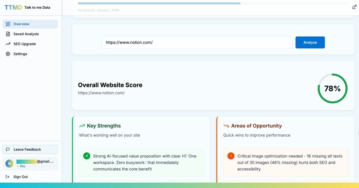
Using AI to Optimize Landing Pages
Manual landing page analysis requires expertise in UX design, copywriting, conversion psychology, and technical optimization. AI accelerates this by analyzing hundreds of factors instantly.
Talk to me Data evaluates your landing pages across all conversion-critical factors: form design, page structure, messaging clarity, mobile experience, page speed, and trust signals. Instead of guessing what to fix, get a prioritized list ranked by expected conversion impact. Learn more about using AI for conversion optimization.
Frequently Asked Questions About B2B Lead Generation Landing Pages
Summary: Building Landing Pages That Generate Quality Leads
Effective B2B lead generation landing pages aren't accidents - they're systematic implementations of proven principles. Structure pages with clear value propositions, minimal friction forms, strong social proof, and singular focus. Optimize for mobile, ensure fast load times, and remove navigation distractions.
Remember the data: companies with 10-15 landing pages generate 55% more leads than those with fewer pages. Companies with 40+ landing pages generate 12x more leads. The opportunity isn't building one perfect landing page - it's building many targeted pages, each optimized for specific audiences, campaigns, and offers.
Start with your highest-traffic campaign or most important offer. Build a focused landing page, implement the 7-section framework, test form field counts, and measure results. Then iterate and expand. Every additional optimized landing page compounds your lead generation capacity.
Ready to turn your landing page into a lead machine?
We'll build a custom AI agent that qualifies visitors, captures leads, and books calls — live on your site in days, not months.